
Color Your Comfort Zone
Walking into a living room that reflects your personality is like wrapping yourself in your favorite blanket. The secret? The right paint color—an unassuming backdrop that creates mood, magic, and memories.
Isn’t it amazing how just a shade or two can change the whole feeling of a room?
If you’re ready to breathe new life into your living space, let’s wander through some inspiring color ideas that not only look stunning but truly feel like home.
Why Not Try Blush?

Have you ever wondered what a whisper of pink could do for your living room? Soft pink has a magical way of wrapping a space in calm, almost like a gentle hug.
Try using blush paint on a single wall, or pair it with warm neutrals for a look that feels both inviting and quietly elegant. Sometimes, the softest shade makes the strongest statement.
A few relevant products:
Why Not Try a Peachy Twist?

There’s something irresistible about peach—it’s like a sunbeam captured on your walls! Soft, inviting, and subtly cheerful, peach never feels overpowering, but always puts a smile on your face.
Let a little peach perk up your palette!
Not long ago, I worked with the Thompsons, a young couple torn between going bold and keeping things understated in their first home. After much discussion, we settled on a gentle peach for their living room. The result? Instant warmth, playful light, and a canvas that worked with everything from their mid-century sofa to their heirloom quilt. They loved how the color made guests linger (and their morning coffee taste sweeter!).
If you’re looking to weave peach into your space, try these simple styling tips:
- Pair peach with natural materials, like linen or bamboo, for a fresh, organic vibe.
- Use metallics—think brass or gold—for a dash of grown-up glam that doesn’t overpower.
A touch of peach, and suddenly—your living room feels like the happiest spot in the house.
Some ideas to consider:
Texture Triumphs: Walls with Heart

Subtle texture on a wall does something a simple coat of paint never could: it invites you to feel the room, not just see it.
I once guided my clients, Maya and Jordan, through adding a brushed plaster finish in their living room. At first, Maya was hesitant—she worried it would feel too busy. We went with a pale, muted clay shade and a whisper of texture. The result? Their space felt richer and much more welcoming, like their walls had stories to tell. Whether you choose a textured wallpaper or mix a paint additive for a gentle stucco effect, remember: texture is the secret ingredient for depth without clutter.
May just do the trick:
Invigorate with Stormy Blue

Stormy blue is both invigorating and calming, perfect for a balanced living space. Its rich undertones can create a dramatic yet harmonious environment.
A few choices to try:
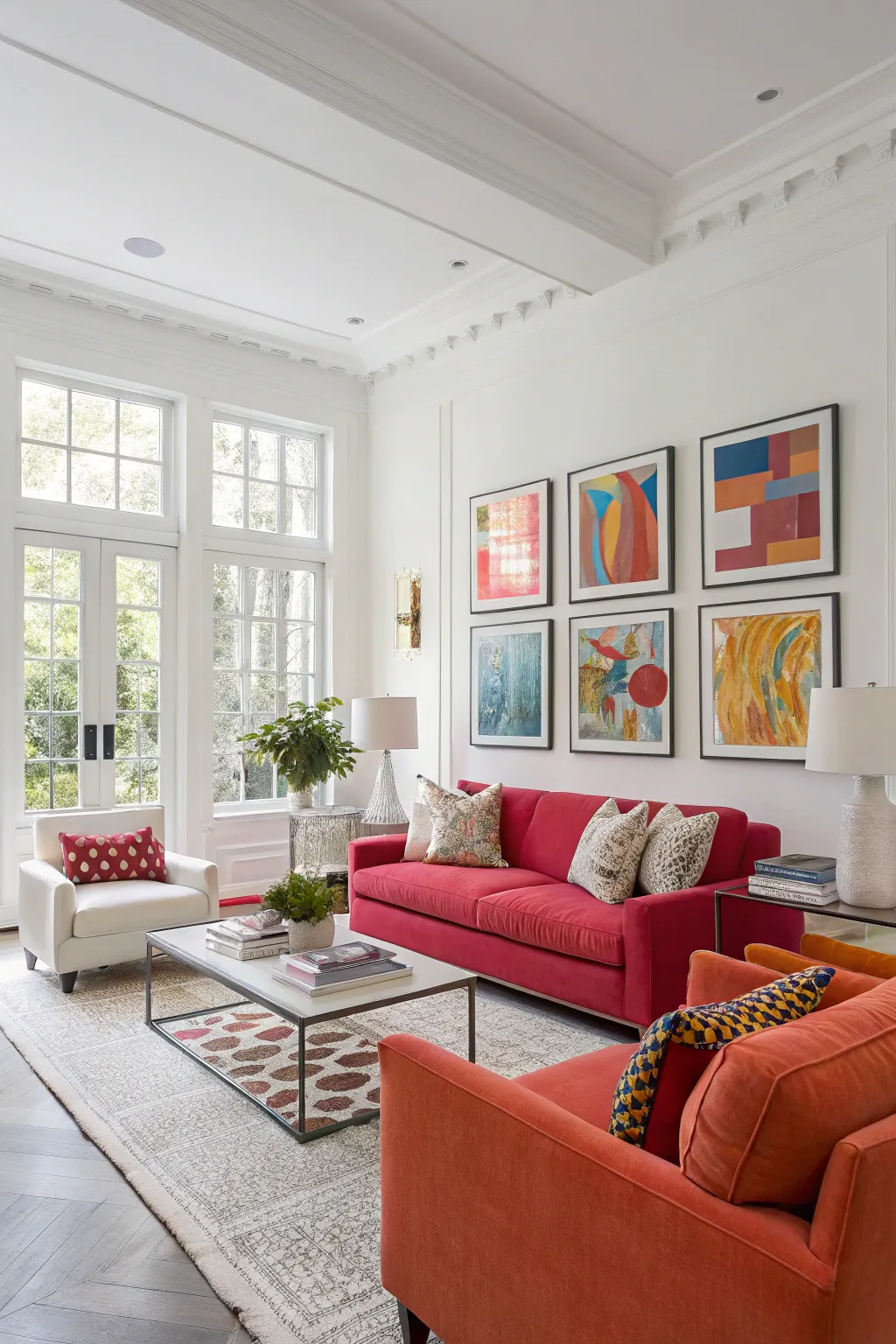
Dare to Pink: How a Bold Color Choice Can Transform Your Living Room

If your living room is crying out for energy, confidence, and a hit of happiness, why not consider bright pink? I know, it sounds daring—but sometimes that’s exactly what a tired space needs. Pink is bold, but it’s also versatile when styled just right.
The trick lies in balance.
To keep your space feeling stylish instead of overwhelming, anchor the pink with neutral elements. Here’s how:
- Mix in lots of white or soft beige to keep things airy and open.
- Choose natural woods or stone for coffee and side tables to ground the look.
- Incorporate greenery—plants are a perfect foil for vivid pink!
- Accent with metallics for a dash of glam without visual clutter.
One of my favorite projects was working with Sarah, a busy mother of three, who longed for something vibrant but worried about going “too far.” With careful planning, we chose a bright pink focal wall and surrounded it with creamy neutrals, simple art, and handmade touches. The kids gravitated toward the space, and friends couldn’t stop complimenting her chic, playful style. Sarah was thrilled—her living room finally reflected her upbeat personality.
Remember: Pink isn’t just for nurseries or parties. With thoughtful styling, it can bring a joyful spark to grown-up spaces, too.
Will you be brave enough to see your living room in a new light?
These products might help:
From Forest Canopy to Cozy Corner: Harnessing Green’s Tranquil Magic Indoors

Green isn’t just a color—it’s a feeling. I’ve seen how a living room washed in earthy green tones has the uncanny power to make people take a deep, grounding breath the moment they walk in.
When I worked with the Thompsons, newly minted parents and plant-lovers, they were torn: How to create a living space that was both calming and curious? We turned to a palette of moss, olive, and muted sage. The result? A gentle indoor sanctuary that echoed their love for the outdoors, but was every bit as functional as it was beautiful.
Let’s pause and consider how you can bring the outdoors into your space. Here are four ways to create that earthy, green connection:
- Layer multiple green paint shades for subtle richness.
- Pair green walls with natural wood, rattan, or linen for added texture.
- Scatter real or faux plants at varying heights—shelves, corners, tabletops.
- Use green as a backdrop for artwork or books, letting them pop organically.
Why settle for just a view of nature when you can invite it right inside your living room?
Items that may come in handy:
Greige: The Color Chameleon’s Secret Weapon

Some colors fade quietly into the background, but greige—a masterful blend of grey and beige—has a way of morphing to fit every mood and every moment. If you ever find yourself torn between cool sophistication and cozy warmth, greige offers the perfect middle ground.
Why settle for ordinary when you can have elegant versatility?
I remember assisting Maya, a newlywed client who was determined to create a living room that felt both timeless and ready for any season. She was anxious about committing to a color that might feel too cold, or too brown, especially as she often switched up her accent pieces for different holidays.
Here’s why greige is my go-to for clients who crave flexibility:
- Adapts beautifully to both warm wood and cool metals, making it a designer’s dream.
- Elevates everyday decor, letting bold or subtle accents shine through without competing.
- Invites natural light to dance, shifting its tone throughout the day for an ever-changing palette.
Because greige is so forgiving, you can experiment—swap in a patterned throw, dramatic art, or even a splashy bouquet without fear of clashing. The color becomes your canvas. Over the years, I’ve seen it harmonize modern spaces, rustic corners, and everything in between.
Let greige be the foundation for your next inspired living room makeover.
Check if these fit your needs:
Calm Canvas: Neutrals that Whisper Wonder

Neutrals are never just a “blank slate”—they’re the hush before the symphony, the gentle welcome that lets your favorite pieces sing.
I love asking clients to envision their living room as a soft, layered canvas. What stories do you want your space to tell? The right neutral—be it a sandy beige or a misty gray—sets the tone for every other element to shine.
- Anchor your room with a pale base for maximum light and flexibility.
- Layer in textural accents—think chunky knits or woven baskets—for added warmth.
- Mix warm and cool neutrals (yes, you can!) for quiet depth without chaos.
One of my most memorable projects was with Emily and Mark, who longed for calm but feared “boring.” By combining creamy walls with soft gray textiles and pops of walnut wood, their space transformed into a haven—inviting and uncluttered, yet packed with personality.
So, if you’re craving a peaceful sanctuary, don’t underestimate the power of whisper-soft neutrals. They’re subtle, sophisticated, and oh-so-easy to live with.
Products that could assist:
Lilac Logic: Let Your Living Room Bloom

Oh, lilac—why do so many shy away from your soft, playful personality? Choosing lilac for your living room is a little like thinking outside the (beige) box. It’s not just a color, it’s a mood—unexpected, whimsical, and oh-so-chic.
Looking for ways to layer this charming shade? Consider mixing lilac with textured neutrals, metallics, or even greenery. The effect is magical: equal parts delicate and daring. If you’ve ever wondered, “Can I really pull off this color?”—my answer is a resounding yes! Here are four fresh spins you can try:
- Paint an accent wall in lilac and keep trims crisp white for contrast.
- Incorporate plush lilac throws or pillows to gently sprinkle color.
- Drape fairy lights nearby to play up the ethereal vibe.
- Add sculptural vases in clear or frosted glass for a soft finish.
I worked with Priya, a young professional looking to inject personality into her studio. Together, we created a lilac nook with a cozy reading chair, art in mismatched frames, and soft lighting.
Seeing her delight as the space came together was the real reward. Lilac can be your ticket to a living room that’s as individual as you are.
Possibly helpful picks:
Go Rustic Red!

Thinking about tradition with a twist? Rustic red is a color that wraps your living room in warmth like a favorite flannel blanket. I always find this shade pairs beautifully with dark woods, plush leathers, and candle-like golden lighting. It’s a classic choice for anyone who loves a room that feels rooted and rich, yet never stuffy.
Just a whisper of rustic red on your walls can set the scene for cozy conversations and timeless, welcoming style.
Ready to try red?
A few suggestions:
Balance & Brilliance: Light Meets Night

Contrast is the spice of life—and your living room! There’s something magical about pairing a delicate, airy gray with a moody charcoal or navy that instantly elevates a space.
I remember helping Sarah, a busy mother of three, reimagine her family room. She loved the coziness of deep hues but didn’t want the space to feel heavy. Our secret sauce?
- Use light walls as a canvas and save bold hues for trim, built-ins, or an accent chair.
- Balance dark furniture with soft, sheer drapes or pale accessories for breathing room.
Just imagine: Every shade in your living room playing its part in a visual duet. Would you dare to dance with contrast?
You might give these a try:
Sage Advice: Channel Retro Charm with Green Hues

Sage green is quietly captivating—a color that feels familiar and fresh all at once. There’s a timelessness in its tranquility, instantly conjuring retro charm while keeping things sophisticated.
Here’s how I like to highlight this hue in a living room:
- Layer different shades of green for a tone-on-tone palette.
- Pair sage with touches of brass, clay, or velvet for retro flair.
- Anchor the look with classic wood furniture to ground the room.
The result is a living room that invites you to settle in, pause, and enjoy a slower rhythm—like the best moments from the past, revived for today.
It’s retro, but never old-fashioned.
Give these a look:
Why Choose Mellow Blues for Modern Living Rooms?

When was the last time you walked into a room and immediately felt your shoulders drop, your breath deepen, and that sense of true calm wash over you? Muted blues have a secret superpower: they coax relaxation without feeling cold or dreary, making them a sublime choice for any living room where tranquility is top of your wish list.
I’ve noticed how blue’s many moods can be tailored to a space—whether you’re after subtle sophistication or a whisper of charm. The secret lies in layering textures and tones. Try combining a blue wall with natural woods, linen, or even a matte gold accent. It’s a formula that makes feeling blue never looked so good. To make these hues sing, I like to introduce:
- Creamy white throws or pillows for a cloud-like vibe.
- Soft oak or rattan furniture that adds warmth.
- Accent pottery in muted navy or slate for dimension.
One client, Emily, craved a calm retreat after busy days. We transformed her space with a powder blue wall and oversized woven rug. She still tells me the room feels like an oasis—a space where every worry takes a backseat.
And here’s the thing:
Muted blues are not just a trend—they’re an invitation. Pair them with gentle lighting and you’ll create a living room that soothes, inspires, and always welcomes you (and your guests) back in.
A few things you might like:
Creating Drama and Depth: Deep Teal Done Right

Deep teal is a paint color with presence. Rich, saturated, and somehow endlessly inviting, it has the power to pull a room together—no matter how eclectic your style. This shade is both bold and soothing, making it my go-to pick whenever a living room needs a little luxury without losing its warmth.
If you want drama, go for an accent wall.
For subtlety, keep deep teal on trims, built-ins, or textiles.
Teal plays beautifully with metallics, especially antique brass, and with woods in any tone—it’s a perfect companion to both vintage and modern looks.
I once worked with the Thompsons, a young family eager to create a living room that felt grownup yet playful. By pairing deep teal walls with honey-toned wood and gleaming brass, we made their compact space feel cozy, layered, and truly one-of-a-kind. Don’t be afraid to play around—sometimes, a little drama is the secret to a room you’ll love.
Deep teal isn’t just a color; it’s a mood..
A few helpful options:
Can Two-Tone Walls Transform Your Space?

Color isn’t just about a single swipe on the wall—it’s an invitation to play, define, and experiment. Two-toned walls are a perfect way to stretch your creativity, adding visual movement and subtle separation to your living room. I know it can feel intimidating at first, but the payoff is stunning. Color blocking can guide the eye and turn the room from one big box into a collection of harmonious zones.
When Sam, one of my clients, approached me about updating his studio apartment, he wanted both coziness and airiness—ideally, at the same time! We used a deep olive for the bottom third of his walls and a creamy taupe for the top. I could see the magic happen as the space instantly felt taller and more balanced. If you’re curious where to start, here are a few ways two-tone walls work wonders:
- Visually divide rooms without physical barriers (perfect for open concepts and small spaces!)
- Pair muted tones for a classic, understated look—or bold contrasts for a pop of personality.
- Highlight architectural details, like wainscoting or built-in shelving.
Remember, painter’s tape is your best friend for crisp edges, and always start with a primer for an even finish. Want to shake things up? Try going vertical or diagonal instead of the typical horizontal split. Who says rules are set in stone?
Bring your personality to the palette. Color is more than a backdrop—it’s a conversation starter, a mood lifter, and sometimes, a gentle nudge to try something new.
Would you ever dare to ditch the single-color wall? It might just be the change your space craves.
Check these products out:
Bold and Gold: Black Accents That Pack Impact

Black is bold, but never brash. When you choose a black accent wall, you’re setting the stage for drama and sophistication—yet your space can still feel welcoming if you balance those rich tones with warmth and texture. A touch of black can be the exclamation point in your design story.
I’ll never forget working with the Thompsons on their first home. They couldn’t agree at first—Jenna wanted something dramatic, while Marcus preferred a more classic look. We compromised by painting one wall in deep matte black, then layered in gold-framed artwork and soft, neutral furnishings. It wasn’t just a background; it became a statement piece, drawing the eye and anchoring the whole room.
If you’re considering this daring move, here are two golden rules I always share with my clients:
- Do use metallics, pastels, or fresh greenery to soften the edge of black and keep things lively.
- Don’t let the wall stand alone—add layered lighting and tactile finishes, like velvet or wood, to prevent the space from feeling stark.
Don’t be afraid to make a statement. The right black accent creates a sense of intimacy and modernity that’s entirely unique to your home. Are you ready to let your walls whisper—and sometimes shout—a bit of drama?
Explore these options:
Mahogany Magic: Deep, Dramatic Design

Mahogany is the color equivalent of embracing the shadows—rich, inviting, and layered with intrigue. Using this luscious tone on your living room walls transforms bland to grand, setting a scene that whispers elegance with every glance.
When I design with mahogany, I think of luxurious hotel lounges where conversations linger and time slows. As one of my favorite clients once said, “True luxury is feeling at home in your own space.” Deep mahogany works especially well with soft golds, creamy leathers, or jewel-toned accents for a moody, intimate feel.
Drama isn’t always loud. Sometimes it’s the subtle sophistication of a room that tells its own story.
Possibly handy products:
Dare You Paint It Bold?

There’s a special kind of magic in an accent wall. When you choose a bold color—think deep blue, rich green, or even a sumptuous terracotta—your living room suddenly pulses with new energy and focus.
Which wall calls out for a transformation? Don’t be afraid to let your personality show, because sometimes, all it takes is one daring stroke.
Consider these options:
Yellow Mellow? Make Your Living Room Glow!

Ever felt like your living room needed a little ray of sunshine? Injecting energy is as easy as reaching for a pot of sunshine yellow paint. This color can act like your daily dose of Vitamin D, especially on those cloudy afternoons when the world outside feels dull.
Linda and James, a wonderful couple with two energetic kids, once asked me for ideas to liven up their modest family living room. Instead of painting an entire wall, we chose a strategic accent area behind their record console. The moment we brushed on that vibrant yellow, the whole space transformed. Suddenly, their favorite reading nook became everyone’s favorite place to relax, play, and connect.
Small changes bring big joy.
Ready to add a splash of yellow to your own space? Here are some easy ways to make it work:
- Balance yellow with whites, grays, or warm woods for a cohesive look.
- Use yellow as an accent on pillows, art, or a single feature wall.
- Let natural light bounce off yellow accents to maximize brightness.
- Experiment with different shades—from mellow buttercream to bold lemon.
Yellow is the ultimate “burst of energy” for your living room, but like the sun itself, it’s warmest when paired thoughtfully. Let your space catch the light and see just how lively it becomes.
Might be a good match:
Light, Bright, and Oh-So-Inviting

Is there anything more uplifting than walking into a living room bathed in warm white? I think not. Gentle, creamy whites have a magical way of making a space feel both larger and infinitely friendlier. Whenever I’m working with a sunlit room, warm white is my go-to—it’s like a soft embrace for the whole family.
Let the light shine in, and see your room glow with warmth!
Maybe worth checking out:
Simply White

_A white wall isn’t empty—it’s brimming with possibility._
Whether you’re displaying bold artwork or letting your favorite plants pop, clean white instantly says modern, chic, and open. Your living room becomes a reflection of your personality—every treasured find or playful accent takes center stage, effortlessly.