
Negative space—the unfilled areas in a design—often holds more power than what we actually put into a room or landscape. After fifteen years of designing spaces across the country, I’ve observed that clients are frequently amazed when removing elements creates more impact than adding them. This guide explores how thoughtfully designed emptiness can transform your spaces, bring balance to chaotic environments, and highlight what truly matters in your home and garden.
Understanding the Concept of Negative Space
Negative space, also known as white space or empty space, refers to the unoccupied areas within a design. It’s the breathing room found around, between, and within objects, furniture, and architectural elements. Far from being “nothing,” these spaces actively shape perception, create visual hierarchies, and guide the eye through environments.
The Psychological Impact of Negative Space
Negative space impacts how we experience environments on multiple levels:
| Psychological Effect | How Negative Space Creates It | Design Application |
|---|---|---|
| Calm and relaxation | Reduces visual stimulation | Living rooms, bedrooms |
| Focus and clarity | Eliminates distractions | Home offices, reading nooks |
| Spaciousness | Creates perceived depth | Small rooms, compact gardens |
| Emphasis | Isolates important elements | Feature walls, specimen plants |
| Balance | Counterweights busy areas | Throughout the home |
When clients express a desire for serene bedrooms or focused workspaces, my first consideration is using negative space as the foundation. Often, the design process involves strategically removing items from initial plans rather than adding more. The transformation in how a space feels is immediate and profound.
Negative Space in Interior Design
Furniture Arrangement: The Art of Breathing Room

The most common misstep I see in homes is overcrowding with furniture. When working with clients, I recommend following these principles:
- Leave circulation paths between furniture arrangements (at least 30 inches)
- Create visual breaks between furniture groupings
- Allow furniture to “float” rather than pushing everything against walls
- Establish focal points that are enhanced by surrounding emptiness
- Consider sight lines and leave open areas to draw the eye through space
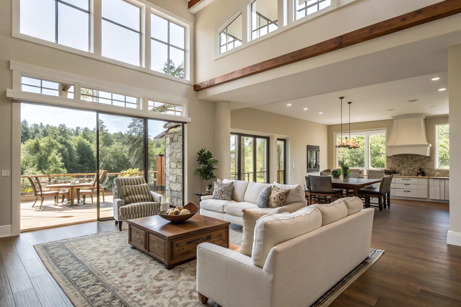
“Less is more” may be a cliché, but it’s profoundly true when arranging furniture. For instance, a family I worked with initially felt they needed three sofas to accommodate large gatherings. By instead selecting one quality sectional and two elegant armchairs with thoughtful spacing, the room comfortably hosted the same number of people while feeling significantly more spacious.
Wall Space: The Power of Restraint

Walls offer prime opportunities for implementing negative space in design. Rather than filling every wall with art or shelving, selective use creates powerful focus areas:
- Designate one wall as a feature wall, leaving adjacent walls simpler
- Group artwork with intentional negative space surrounding it
- Leave upper portions of walls empty to enhance ceiling height
- Create asymmetrical arrangements that incorporate empty areas
In a recent townhouse project, we deliberately left a full wall empty in the dining room, while placing a large-scale abstract painting on the adjacent wall. The impact of the painting was frequently noted by guests, an effect largely amplified by the surrounding negative space.
Case Study: The Transformed Living Room
A client in Santa Rosa came to me after losing her home in a fire. The architect had created a beautiful design, but it didn’t align with her personal vision for the space. As we reviewed the plans, I noticed that the living room was crowded with built-ins and architectural features.
By eliminating some built-ins and creating intentional negative space around the fireplace, we transformed the room into a sanctuary. This approach allowed her collected artwork to breathe and the architectural elements to stand as proper focal points. This experience reinforced my belief that sometimes the most profound design intervention is simply allowing for emptiness.
Negative Space in Landscape Design
The Lawn as Negative Space

In landscape design, the lawn often serves as the primary negative space, providing visual relief from densely planted areas. When working with garden spaces, I encourage clients to think of:
- Clean flowing bed lines to define lawn areas
- Proportional balance between planted and open spaces
- Strategic views enhanced by negative space
- Movement patterns through the landscape
For clients concerned about lawn maintenance, alternatives like uniform groundcovers, gravel areas, or step-able plants can create similar negative space effects.
Case Study: The Natural-Looking Landscape that Was Carefully Planned
One of my favorite projects involved a sloping backyard in Great Falls. The homeowners desired a naturalistic landscape, something that appeared effortlessly integrated with the surroundings. Working with the ten-foot grade change, we created a design that incorporated multiple outdoor rooms connected by gently stepped walking paths.
The secret to achieving this effortless feel was the deliberate use of negative space. Large lawn areas served as visual counterpoints to tree groupings and planting beds. This negative space allowed architectural features like the “folly” (a purely decorative structure at the property’s perimeter) to stand out as focal points.
The design also incorporated what landscape architects call “passive negative spaces”—areas that aren’t primary focal points but provide visual relief between more dominant elements. These spaces allowed the landscape to unfold naturally as one moved through it.
Practical Applications of Negative Space in Different Rooms
Kitchen: The Case for Open Space

Kitchens often suffer from overcrowding, with every available surface used for storage. Consider these approaches to incorporate negative space:
- Skip upper cabinetry in favor of a few open shelves with breathing room
- Create open counter areas without appliances or decorative items
- Design asymmetrical cabinetry arrangements with intentional breaks
- Leave visual “pauses” between kitchen zones
Even clients initially set on maximizing cabinet space often discover the benefits of restraint. In one project, convincing a homeowner to leave one wall cabinet-free resulted in a kitchen that immediately felt more spacious, allowing the pendant lights to become a striking feature rather than competing visually with cabinetry.
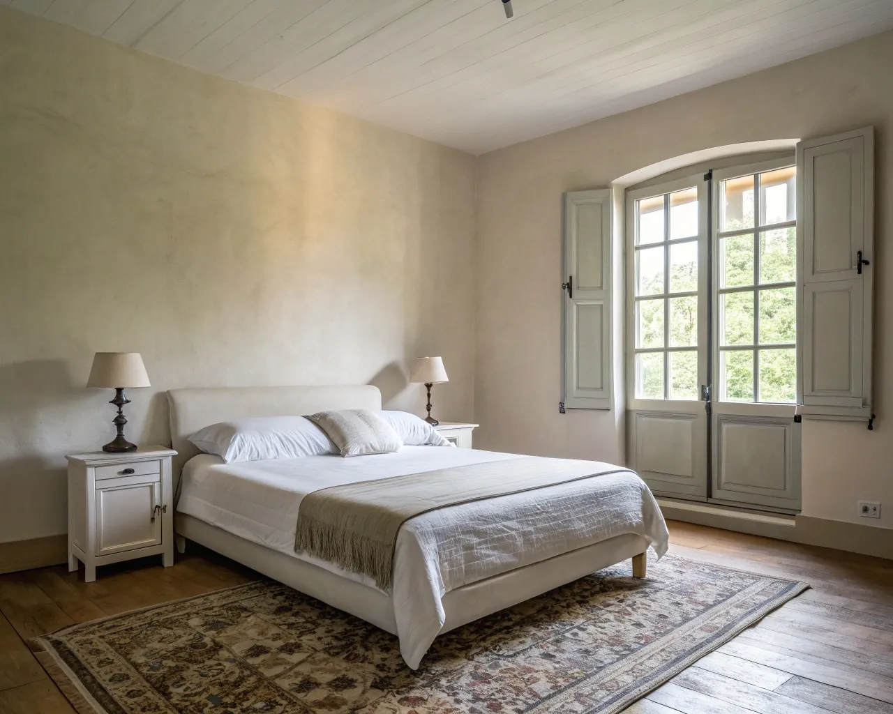
Bedroom: Creating Calm Through Emptiness
Bedrooms benefit tremendously from negative space. When I design bedrooms, I prioritize:
- Open floor space around the bed
- Simplified nightstand arrangements with minimal items
- Selective wall decor that doesn’t overwhelm
- Visual breaks between furniture pieces
The 360-degree spin test works particularly well in bedrooms: stand in the center of the room and slowly spin a full circle. Your eye should take in both “visual highs” (focal points) and “visual lows” (negative spaces) as you turn. This creates rhythm and prevents visual exhaustion.
Common Mistakes to Avoid When Using Negative Space
| Mistake | Consequence | Solution |
|---|---|---|
| Overcrowding | Room feels cluttered and chaotic | Remove non-essential pieces, increase spacing |
| Ignoring function | Beautiful but impractical spaces | Balance negative space with functional needs |
| Being too matchy-matchy | Static, predictable design | Mix textures and styles with negative space as buffer |
| Unintentional negative space | Feels unfinished rather than purposeful | Create deliberate, shaped negative spaces |
| Too much negative space | Room feels barren or unwelcoming | Add focal points and texture while maintaining some emptiness |
Tips for Incorporating Negative Space: A Room-by-Room Guide
Living Room
- Create conversation areas with breathing room between seating
- Designate one wall as a feature wall, keeping others simpler
- Allow art pieces to stand alone with space around them
- Consider visual pauses between furniture groupings
Dining Room
- Leave ample space (at least 36 inches) around dining tables
- Create negative space above tables with minimalist lighting
- Resist the urge to fill every wall with decor
- Allow architectural features to stand out through surrounding emptiness
Home Office
- Clear desktop surfaces of unnecessary items
- Create focused work zones surrounded by negative space
- Leave open wall areas to reduce visual distraction
- Consider asymmetrical arrangements with intentional pauses
Small Spaces
- Use light colors to enhance negative space
- Optimize storage to reduce visual clutter
- Create visual depth through strategic negative space
- Choose multi-functional pieces that don’t overwhelm
The Balance Between Positive and Negative Space
Finding the right balance between filled and empty space is both art and science. I’ve found that the most successful spaces typically maintain a 60/40 ratio—either 60% positive space and 40% negative, or vice versa, depending on the desired effect.
When guiding clients who struggle with decluttering, I often suggest the “negative space day” exercise. For one day, focus exclusively on what you’re *not* adding to spaces, rather than what you *are* adding. This shift in perspective often reveals the power of restraint.
One technique I’ve refined over years of practice is what I call “intentional subtraction.” After completing an initial design, I systematically remove elements until the space achieves maximum impact with minimum components. This process invariably leads to stronger, more confident designs.